23/4/2024 - 22/7/2024 ( Week 1 - Week 14 )
Ho Winnie / 0364866
Interactive Design / Bachelor's of Design Honors In Creative Media
Final Compilation & Reflection
INDEX
SUBMISSIONS
Exercise 1 : Website Analysis
22/4/2024 - 5/10/2024 ( Week 1 - Week 8 )
1) Purpose and Goals :
 |
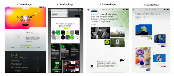
Fig 2.1 Screen capture of homepage
|
Upsense is a highly interactive modern web platform that promotes their business services which is mainly based on branding, web designs , product designs and strategic designs that focuses on helping business growth
It shows different past examples of products they did before for clients and showcases testimonials by them too, serving as a factor to building credibility in their works. They hope to attract future potential customers by providing FAQs and starting plans for them in the website as well.
Overall, it serves its primary purpose which is to convert visitors to clients by showing their works and results-driven approach.
2) Visual Design and Layout :
Colors :
 |
| Fig 2.1 Upsense Color Palettes |
Upsense makes use of primarily neutral tones such as black, white and grey for the background which gives a new modern look. This clean minimalist style is complemented by mixing in vibrant colors like neon green and yellow to specially highlight CTA buttons and important details to let them stand out. This high contrast makes it simpler for visitors to identify the vital elements in this website.
This can aid in guiding the viewer’s eyes smoothly through the website , enhancing both the visual and usability of this website.
 |
| Fig 2.3 Contrasting Colors Used |
However, the contrast between the titles on the navigation top bar and texts with the background is not sufficient. The color of the text blend in easily with the background which makes it eye-straining to read the details, hence affecting the overall user experience. It is recommended to use a higher contrast color for the texts and make the options on the top navigation bar into buttons so it is easier to identify.
 |
| Fig 2.4 Unclear texts due to low contrast |
I noticed that some CTA buttons have inconsistent colors especially on the "Insights" page as normally the buttons are neon green in color on other pages but on this page there is other colors like blue. It is best to keep the CTA buttons consistent as too many different colors will confuse users and disrupt visual hierarchy
 |
| Fig 2.5 Inconsistent CTA Button Colors |
Typography : |
| Fig 2.6 Varying Typography |
The use of typography on Upsense is one of the key factors in creating a modern and professional look. The site uses a mix of varying font types (both serif and sans serif) and sizes to create dynamic visual hierarchy. "Creative Design Studio" is being bolded to create a strong impact and the serifs used complements the bold san serifs which showcased the contemporary style of the studio.
Varying font weights are used to create visual hierarchy such as bolding and making the font size bigger for titles. This helps users to differentiate the important details and ensuring a good visual flow throughout the website.
 |
| Fig 2.7 Different font type used |
Imagery :
 |
| Fig 2.8 HD image used |
Upsense's imagery is perfectly in lined with their purpose of offering branding and design services to clients. High quality pictures are placed under their past projects for different clients and it strategically showcased the before and after outlook of their work.
The images include design process and showcased their abilities as a design studio, these images all looks very professional and clean which is vital for a design studio.
This offers the visitors with a wide array of images that showcases creativity and innovation. It not only serves as the key point but also improves the whole visual appearance of the website
Layout :
 |
| Fig 2.9 Layout in Upsense |
The layout of Upsense is grid based which results in organized containers and sections of the contents. This design shows clear presentations of the websites via engaging thumbnails and images that draws the user’s attention.
The sections are divided clearly, ensuring a smooth navigation and flow throughout the website. However, I noticed that there were some inconsistencies to the use of white spaces in some pages.
 |
| Fig 3.0 Excess White Space |
There is excessive white space used on the process page and this will decrease the impact of the message as the table below is just floating on the website without an anchor. This can result in unnecessary scrolling which decreases user experience.
3) Functionality and Usability
Navigation :
Upsense placed the primary navigation at the top that is sticky when being scrolled, this makes it easy for users to find. They also provide clear search engines that allows users to filter the categories they want to find.
 |
| Fig 3.1 Tags used as filter |
The use of tags aids in navigation as they act as a filter to allow users to search for specific services they want to find. This will help to enhance their search experience as they do not need to search through unrelated topics.
 |
| Fig 3.2 CTA Buttons of the same use |
However, on the home page there is 2 CTA buttons of the same usage which navigates to the " Book a Free Strategy Call " page. Putting them close to one another will decrease the effectiveness of the button and confuse the users on whether the buttons perform the same functions. It is advised to put just 1 clear button to communicate effectively to users.
The overall goal of these navigation is to improve the user experience and making it seamless for users to navigate between different sections of the website.
Forms :
 |
| Fig 3.3 Missing information and details in forms |
Upsense has one form which allows users to start a project with them but when i click onto it, I noticed many insufficient elements inside. First of all, the details to book timings are unavailable and there are many missing instructions to guide the users. There is no spacing used between the title and the paragraph which makes the form look very cluttered.
This can hinder the user in completing the form and lead to frustration which lowers user experience.
Interactive Elements :
Upsense has multiple good interactive elements that make the website stand out from many different other websites. When we first reach the homepage, there is a line that follows our cursor which I find quite interesting.
Fig 3.4 Upsense Cursor Interactive Element
Moving on next, to view their projects , unlike normal websites which provides just a button, Upsense made it very interactive in which a circle will pop up for users to click once we hover over it.
Fig 3.5 Button popup interactive element
Under their "What We Do" section, when I hover over their services, the words appear to be brighter and a square shaped icon popped up next to it. I personally find it very cool that they manage to put in an effect like that. It really showcases their capabilities in design and their uniqueness as a design studio.
Fig 3.6 Words Hover Effect
All these elements work hand in hand to engage users, provide navigation and add visual feedbacks, providing interaction with the information in the website.
4) Content Quality & Relevance
 |
| Fig 3.7 Content pages on Upsense |
Upsense is primarily focused on showcasing exemplary works from their own studio which aims to attract users to become future potential clients. The content is well organized to tailor to their specific services like branding, web design etc.
The content is being well organized into categories like our services , our culture , insights which allows easy navigation.
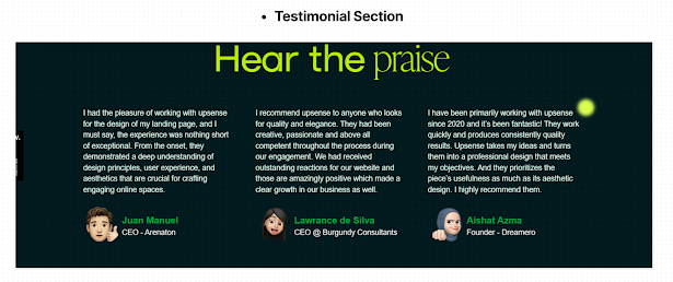 |
| Fig 3.8 Good Testimonials |
Content accuracy is achieved by the detailed critique and testimonial by their past clients which adds to the credibility and illustrates their rich experience in this field.
 |
| Fig 3.9 Good content layout for projects |
Clarity is achieved by having concise and fixed descriptions of the work and roles for past clients .
5) Performance
Load Time :
To test the performance and load times of Upsense , I ran a test via Pagespeed Insights.
According to the results, the transitions mostly can be improved as due to its highly interactive nature. it does gets
slow when I tried to move from one page to the another.
 |
| Fig 4.0 Load time for Upsense |
The time to first byte ( to identify how slow a web server could respond to requests ) could be improved as it delays a while when users try to responsively change the screens .
Responsiveness and Compatibility :
 |
| Fig 4.1 Excess white space on computer and insufficient space on phone |
Upsense works well in all 3 views ( Mobile, tablet and Computer ) , this ensures consistency in the website design.
However, I realized that it is not as optimized for mobile view compared to the rest as quite some interactive elements are missing. There is insufficient space from box to box as shown in the picture on the mobile view, which can make it difficult for users to read the information due to the lack of white space.
Conclusion :
There are notable strengths and weakness to Upsense in relate to User Experience , I will summarize them in point form as show below
Strengths :
1) Navigation - Fixed top navigation bar will give users a smooth journey as it is simple for them to find different sections , as well as the search engine bar.
2) User Friendly Interactive Elements - The dynamic interactive effects gives users an engaging experience which is a big plus point in terms of UX
3) Imagery and Layout - Website uses a grid layout which is a good choice in UX as it is pleasing to look at the organized sections. High resolution images are used to capture the attention of users.
4) Quality Content - With a detailed information and process of each project coupled with amazing testimonials from past clients, Upsense gives a sense of credibility and responsibility as a design studio which highly boost UX.
Weakness :
1) Not as optimized mobile features - Many missing interactive elements and a lack of use of white space can greatly decrease the experience of users as it is harder to read and not as interactive as computer version.
2) Form issues - There is a lack of information under the "Start a Project" form which allows potential clients to contact them. The layout of the form is bad as well as there is no spacing between the title and paragraph, causing a lack of visual hierarchy.
3) Inconsistent colors and placements on CTA Buttons- Varying colors are being used for CTA buttons and some parts of the website, 2 CTA elements of the same purpose are being put side by side which decrease the impact and might even confuse the users . Consistency is vital in allowing users to identify action items and navigate easily
B) Website 2 : Arielbernica - Website Analysis ( Link Here )
1) Purpose and Goals :
 |
| Fig 4.2 Homepage screenshot of Arielbernica |
Arielbernica is an online website portfolio that mainly showcases Ariel's portfolio as a digital designer. The main purpose is to highlight the many success cases of her design experience and high capabilities. This portfolio shows her skillsets, past projects , her design philosophy and the services she offer.
The goal is to attract future potential clients to contact her on any projects and also to establish a brand for herself.
Overall, this site can aid in facilitating her in building more professional connections as well as putting forward her own unique value in the design industry.
2) Visual Design and Layout
Colors :
 |
| Fig 4.3 Color Palette of Arielbernica |
Arielbernica mainly uses a pink tone pastel theme that appears to be minimalistic and gentle at the same time. Pink is a delicate shade that represents compassion, nurturing and approachability. The background is mainly white as well that complements the pink shades, which can make the text stand out.
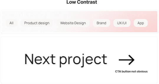 |
| Fig 4.4 Low contrast of buttons |
However, due to the nature of pink and white being both soft and complementary colors, it makes it difficult for some elements to stand out. For example, the top navigation bar is white against a pink pastel gradient background which is tough to see.
Important details like CTA buttons needs to be easy for users to identify , hence the colors used for them needs to have higher contrast.
Typography :
 |
| Fig 4.5 Sans serif font |
Arielbernica uses sans-serif font for the website design which has high readability in nature, make it a plus point for user experience. However, I feel that better usage of white space can be used to enhance visual hierarchy to make it easier to read. In the image above, the texts are all clumped into one paragraph, more important words like "product design" . "UX/UI" and brand design can stand out more, either by using different font weights, colors or white space.
 |
| Fig 4.6 Different font weight creating visual hierarchy |
For example, in the section , she made good use of font size and white space to highlight the important details of the text. This creates a higher impact compared to putting all texts of the same size and font weight together.
 |
| Fig 4.7 Bold texts being used to highlight text |
She made use of bold texts to highlight important details of a paragraph which is a good practice. However, the visual hierarchy can be improved here in having bigger contrast in the title and the paragraph text. The font size of the title is not far from the paragraph text, which did not differentiate the title and the paragraph.
Imagery :
 |
| Fig 4.8 Process images being used |
Arielbernica make use of high quality imagery that is relevant to her skillsets and showcased her design thinking. She placed images for each design step that showcases her thinking as a skilled designer. Other than placing images for her thinking process, she used final product images and before-after images to attract future clients, as well as to build her own brand identity.
 |
| Fig 4.9 High Fidelity Designs Images |
Layout :
 |
| Fig 5.0 Arielbernica's layout |
Arielbernica's website is mainly made up of two columns which clearly shows different sections. It has a clean layout that has a logical structure, especially in the project section page that tells a story step by step regarding her design process.
 |
| Fig 5.1 Different alignments used |
However, there appears to be minor inconsistency in the alignment and layout of some paragraphs. There are some texts that are aligned left and some are aligned center , if the layout between sections is inconsistent without clear reasons, it can confuse users and make the content look disorganized.
3) Functionality and Usability
Navigation :
 |
| Fig 5.2 Navigation elements used in website |
Arielbernica uses a few good navigation components that are effective in aiding website navigation. The top navigation shows the main CTA tags like "Home" , "Work" , "About Me" that allows users to easily find these sections.
The bottom footer organizes social media links of Ariel which allows users to easily click into her materials, this reduces cluttering on the main page.
Tags are used as a filter to allow users to find specific services they are interested in, without scrolling through everything. However, as mentioned above, CTA buttons need higher contrast to highlight them as low contrast can cause users to missed out the importance level of that button and in turn , decreases user experience.
Forms :
 |
| Fig 5.3 Contact form |
There appears to be only one form in this website which is when I click on the "Hire Me" CTA button. It brings me to this page which is a link to her e-mail, I assume its for users to send her an email if they want to collaborate with her.
Although it is very simple, I feel that more details should be provided to the users if she wish for them to reach out to her. For example, including certain templates for users to follow, in this way , users would not be confused on how to approach her.
Interactive Elements :
Arielbernica has a decent amount of interactive elements that enhances the overall outlook and user experience of users , when I first reach the homepage , the background changes gradually to pink pastel according to where my cursor goes , her icon on the left is interactive as well
Fig 5.4 Color palette changing with cursor
Under the project section, when I hover over the images, I realised that the icons inside the image slightly moves up and down, including have a new CTA button on the top right as well
Fig 5.5 Element moving up and down when cursor touches
When I click inside the project, the interaction becomes even higher as I am able to scroll her prototype and look at the details inside which I find very useful if I am a potential customer
Fig 5.6 Interactive scrolling of pages
The most interesting element i find is under the "Capabilities" section as I am able to drag and pull each individual boxes. I rarely find such interactive elements in most portfolios I visited
Fig 5.7 Moving interactive buttons
All these highly interactive elements used in her portfolio showcased her skills as an experience designer as well because it is highly engaging and these elements help her standout from other designers.
4) Content Quality & Relevance
Fig 5.8 Content of Arielbernica
Arielbernica is well organized into pages that is highly relevant in showcasing her skills as a professional designer. The portfolio highlights all her projects, including brand design , product design , website design which shows her wide array of flexibility in design.
The case studies shows her insights and work process which is vital for future clients to understand her working style better.
Additionally, she placed her own articles which offers more in depth into how she thinks about design, this can aid clients to better understand her.
Fig 6.0 FAQ Section Being Provided
Clarity is clear as well because Ariel specially included a FAQ section on commonly asked questions which improves UX by anticipating commonly asked questions which help to save time and effort of users.
5) Performance
Load Times :
To test the performance and speed, I ran a test via page speed insights as well and the performance level is considered above average but the first content to load on a page takes slightly longer timing.
 |
| Fig 6.1 Performance Level Indicator |
Responsiveness and Compatibility :
 |
| Fig 6.2 Responsiveness Level |
Arielbernica only works better on computer view mostly as the mobile and tablet view is not that optimised. It has many not required white space that needs the users to scroll down more.
This can decrease the overall experience of the user as they need to spend more time going through unneccessary elements. It is important to ensure that the website needs to be fully responsive.
There are notable strengths and weakness to Arielbernica Portfolio in relate to User Experience , I will summarize them in point form as show below
Strengths :
1) Navigation - Fixed top navigation bar will give users a smooth journey as it is simple for them to find different sections , as well as including tags that divides accordingly into the different work she does.
2) User Friendly Interactive Elements - The unique elements used in the website help her stand out as a an experienced designer.
3) Imagery and Layout - Website uses a grid layout which is a good choice in UX as it is pleasing to look at the organized sections. High resolution images are used to capture the attention of users.
4) Quality Content - With FAQ being added to anticipate potential questions, it gives clients a good user experience knowing she is well prepared. I felt that the article section is vital too in letting people understand her work style.
Weakness :
1) Not as optimized mobile and tablet features - There is huge white spaces that needs scrolling in the mobile and tablet which decrease the experience of users.
2) Unclear way of contact - There is a lack of information on how exactly she prefers clients to reach her, although an email is being placed there, she did not specify to email her and what kind of content does she need or expect from future clients.
3) Low contrast on CTA Buttons - The buttons blend in together with the background which defeats the impact of the CTA button. Users might miss out on the importance of that and end up not being able to quickly locate the button on first look which may lead to confusion.
Exercise 2 : Website Replication
22/4/2024 - 5/10/2024 ( Week 1 - Week 8 )
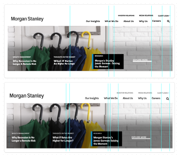
A) Website #1 - Morgan Stanley
 |
| Fig 6.5 Original vs Replication of Header |
 |
| Fig 6.7 Replication vs Original of Body |
 |
| Fig 6.9 Replication vs Original of footer |
Overall Outlook of the Website :
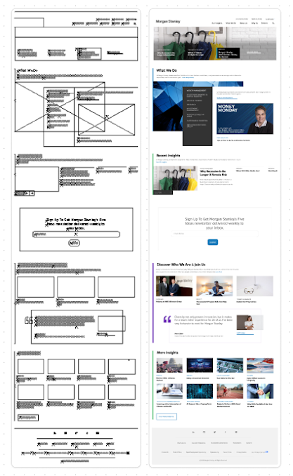 |
| Fig 7.0 Outline and Full Replication of Website |
Overall Comparison of the Website : Left (Replicate), Right (Original)
 |
| Fig 7.1 Website Comparison |
B) Website #2 - Ocean Index
Header comparison : Left (Replicate) , Right (Original)
 |
| Fig 7.5 Header comparison |
Body comparison : Left (Replicate) , Right (Original)
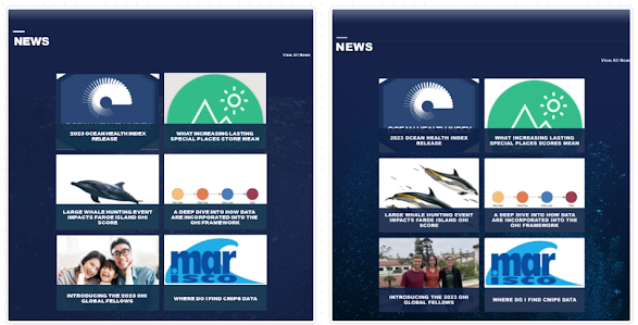 |
| Fig 7.6 Body comparison |
Footer comparison : Top (Replicate) , Bottom (Original)
 |
| Fig 7.7 Footer comparison |
Overall Website Structure and Outline :
 |
| Fig 7.8 Website Structure |
 |
| Fig 7.9 Comparison of Websites |
Exercise 3 : CSS Recipe Layout
22/4/2024 - 5/10/2024 ( Week 1 - Week 8 )
 |
Fig 9.8 Screenshot of recipe card, Week 7 (6/9/2024)
|
Project 1 : Prototype Design
13/5/2024 - 27/5/2024 ( Week 4 - Week 6 )
 |
Fig 3.4 Final Digitalization , Week 5 (5/21/2024)
View my CV Prototype in Figma :
Project 2 : Working Web Page 27/5/2024 - 10/6/2024 ( Week 6 - Week 8)
Responsive Design :
Final Screen Grab Big Screen Desktop View :
 | | Fig 2.8 Desktop View |
Final Screen Grab Small Screen Mobile View :
.png) | | Fig 2.9 Small screen view |
Final HTML PDF Code :
Final Desktop CSS Code :
Final Mobile CSS Code :
Final Project : Design Exploration & Application 10/6/2024 - 22/7/2024 ( Week 8 - Week 14)
Responsive Design :
Full Size Screen Grab of Desktop Version :
Full Size Screen Grab of Mobile Version :
Final HTML Codes ( PDF ) :
Final CSS for Desktop ( PDF ) :
Final CSS of Mobile ( PDF ) :
Final Javascript codes ( PDF ) :
|
REFLECTION
Findings :
As I specialize in UI/UX design, I have found this module to be incredibly helpful in honing my coding skills. The structured approach and guidance provided by Mr. Shamsul have been instrumental in instilling good coding practices. Each project within this module has presented unique challenges, progressively increasing in complexity and pushing me to expand my technical abilities.
Despite the difficulties, the experience has been invaluable not only for improving my coding skills but also for enhancing my understanding of effective layout designs. The emphasis on creating well-structured wireframes and thoughtful layouts has provided me with a deeper appreciation for the interplay between design and functionality. This comprehensive approach ensures that I am not just focused on writing code, but also on creating intuitive and visually appealing user interfaces.
Overall, this module has significantly contributed to my growth as a UI/UX designer, equipping me with the skills and knowledge necessary to excel in both the technical and creative aspects of the field.
Observations :
Throughout this module, I have observed the critical importance of continuously refreshing and practicing coding hands-on, rather than merely listening passively in class. Engaging actively with the code while Mr. Shamsul is teaching has proven to be a far superior learning experience. This hands-on approach allows us to experiment with the various properties and techniques we learn, reinforcing our understanding through practical application.
Coding alongside Mr. Shamsul’s instructions provides immediate opportunities to test and explore the concepts being taught. This dynamic interaction not only solidifies our grasp of the material but also encourages us to think creatively and troubleshoot in real-time. By actively participating in the coding process, we can ask questions, receive instant feedback, and make necessary adjustments on the spot, leading to a more profound and nuanced comprehension of the subject matter.
Experience :
Overall, my experience learning coding in this module has been incredibly fruitful. The knowledge and skills I have gained will serve as a solid foundation for future modules, particularly those focused on app development. The challenges presented throughout the course have pushed me to deepen my understanding and refine my techniques, preparing me for more advanced topics.
This module has not only equipped me with essential coding skills but also highlighted the importance of good coding practices and effective design principles. By working through progressively complex projects, I have developed a stronger grasp of how to structure and write clean, efficient code. This foundation is crucial as I move forward into more specialized areas of app development, where these skills will be directly applicable.


.png)


Comments
Post a Comment