Application Design 2 - Task 1 : App Design 1 Self Evaluation & Reflection
21/04/2025 - ( Week 1 - Week 4 )
Ho Winnie / 0364866
Application Design 2 / Bachelor's of Design Honors In Creative Media
Task 1 : App Design 1 Self Evaluation & Reflection
After careful discussion, my team identified AirAsia travelers as the primary audience, focusing on their need for quick access to essential flight details such as boarding time, gate number, seat assignment, and destination. The secondary audience, flight attendants, rely on the boarding pass for passenger verification and seating arrangement, so clarity and accuracy were equally important for them.
We began by analyzing the existing boarding pass layout, identifying areas of clutter and inconsistencies in information hierarchy. From there, we proposed a new design that clearly separates key information into visual zones, uses icons to support quick recognition, and applies font hierarchy to guide the reader’s eye. Our goal was to create a boarding pass that is not only visually appealing but also intuitive and efficient for both user groups.
 |
| Our Attempt |
Key enhancements included a real-time bus arrival tracking feature to reduce uncertainty for travelers, a streamlined seat selection interface for quicker decision-making, and the implementation of downloadable e-tickets for user convenience. Additionally, I added a comprehensive FAQ section to help users navigate the app with ease and resolve common queries independently.
Below are the Figma files and interactive prototypes that showcase these improvements in detail.
In addition to the UX Lab Assistant, I conducted my own critical evaluation and sought external perspectives through Claude.ai, another AI platform that offered diverse suggestions to refine the user experience further.
To ensure a structured and comprehensive assessment, I organized my self-evaluation around the following key sections of the app:
 |
| Fig 1.1 Onboarding Pages |
Self Reflection :
Each page communicates a distinct value:
-
Page 1 sets the tone and purpose.
-
Page 2 explains the main feature (booking).
-
Page 3 adds extra value with live updates.
→ This aligns with Jakob’s Law—users expect familiar, structured onboarding experiences.
Each page uses large contextual imagery (TBS station, booking system, bus) which enhances user orientation and supports the message.
→ A nod to Gestalt’s Law of Similarity – consistent image placement and layout reinforce comprehension.
-
Good use of button hierarchy with visual distinction (color contrast).
The body text is quite dense, especially in Page 2 and 3. Consider:
-
Breaking it into shorter lines or bullet points
-
Highlighting key benefits with bolding or icons
→ Improves scanability and adheres to Hick’s Law (minimize choices and cognitive load).
- The last onboarding screen does not need the skip button , instead change it to a more appealing text like " Let's Get Started "
- Clear visual hierarchy with prominent headlines and well-structured text
- Consistent layout across screens creates a cohesive user experience
- Good use of relevant imagery that relates to transportation services
- Action buttons are prominently displayed and follow consistent placement
- Each screen clearly communicates a distinct value proposition
- Button contrast: The yellow "Sign In" buttons may have insufficient contrast with white text - consider a darker yellow or different color combination
- Information density: Text blocks are relatively long for onboarding screens - consider shorter, more scannable copy
- Account options: The "Do You Have An Account?" and "Sign Up" text at bottom appears small and might be easy to miss
- Accessibility: Consider evaluating color contrast ratios to ensure text is readable for all users
- Visual hierarchy: The "Skip" button has equal visual weight to "Sign In," potentially creating confusion about the primary action
- I feel that AI's evaluation on the button contrast is not valid as the yellow used firstly is part of TBS's branding color and the contrast is high enough against a black text on a light background.
 |
| Fig 1.2 Redesigned Onboarding Screens |
-
I updated the border color of the “Skip” button, making it more visible and accessible by improving its contrast against the white background.
-
I also darkened the “Do you have an account?” text to a deeper grey, enhancing readability and visual hierarchy without drawing too much attention away from the primary call-to-action.
-
On the final onboarding screen, I removed the “Skip” button entirely. By this point, the user has reached the end of the sequence, so skipping is no longer necessary. Instead, a more action-oriented “Let’s Get Started” button was used to guide users into the app.
-
Additionally, I reduced the amount of text on each screen to avoid overwhelming users. This ensures that the key benefits of the app — such as real-time tracking, faster booking, and e-ticket convenience — are communicated clearly and concisely.
 |
| Fig 1.3 Login Pages |
-
The TBS logo is prominent and reinforces brand identity.
-
The “Log In To Your Account” header uses strong typography for immediate clarity.
-
The yellow "Sign In" button is visually dominant and aligns with your onboarding CTA style.
→ This supports Nielsen’s Visibility of System Status and ensures cognitive ease.
2. Well-Designed Input Fields
-
Email and password fields are clear, with good spacing and familiar placeholder behavior.
-
The "show/hide password" icon is a great usability touch.
→ Aligns with Fitts’ Law and Error Prevention Heuristics (user can avoid typos with password visibility).
-
Social sign-ins (Google, Facebook, Apple) are easily recognizable by icon.
-
This provides flexibility and reduces friction, especially for users who prefer SSO (Single Sign-On).
→ Good application of User Control and Freedom.
Suggestions For Improvements :
-
It feels slightly detached from the password field.
-
It could use lighter styling (e.g., underlined or grey) to indicate it's a link—but also increase touch target size.
-
The text “No Account Yet? Register Here” is quite faint on the white background, especially the first part.
-
Currently shows only icons without text labels.
Suggestion: Add text labels underneath or on hover (e.g., “Sign in with Google”) to enhance accessibility and clarity for all users (especially new or visually impaired users).
- Clean, minimal design with good use of white space
- Clear identification with the TBS logo prominently displayed
- Standard login form pattern that users will find familiar
- Alternative login options with social accounts are provided
- Password visibility toggle is included
- Form field styling: The input fields have minimal styling - adding subtle shadows or borders could enhance their visual prominence
- Social login clarity: The social login icons are small and lack explanatory text - users may not immediately understand their function
- Secondary options: "Forgot Password?" and "Register Here" links have different placements and styling, creating visual inconsistency
- I feel that AI's evaluation of the "Forgot Password?" and "Register Here" having different placements and styling causing inconsistency is not valid as both of them aren't the same thing and the Register Here is highlighted in red which encourages uses to create or link the account.
 |
| Fig 1.4 Redesigned Login Screens |
- I updated the placeholder text to “Registered E-mail” and “Password” to make the input expectations more descriptive and user-friendly. This small change is especially helpful for first-time users and aligns with Nielsen’s heuristic of matching the system with the real world.
- I added a horizontal divider labeled “Or continue with” to clearly separate the main login form from the social login options. I also adjusted the spacing between elements to create a more breathable layout. This follows Gestalt’s Law of Proximity, which helps users scan the screen more comfortably.
- I kept the “Sign In” button visually dominant using a bold yellow, while improving the readability of the surrounding text. “No Account Yet?” now has better contrast, and “Register Here” remains red to draw attention without distracting from the main action. This helps users focus while supporting accessibility.
- I added clear labels under each social login icon — Google, Facebook, and Apple ID — to reduce ambiguity and support users who rely on screen readers. This decision follows the principle of recognition over recall, making the screen more inclusive and intuitive.
 |
| Fig 1.5 Home Page Screen |
Self Reflection :
-
The booking panel (departure, destination, date, etc.) is placed at the top, making it immediately actionable.
-
This aligns with user goals—get in, book fast.
→ Strong application of Nielsen’s “Match between system and real-world tasks.”
-
Including a TBS E-Wallet panel with a clear balance and CTA (Add Money) is convenient and informative.
Transaction history is a useful secondary action and doesn’t clutter the primary flow.
→ Supports progressive disclosure and dashboard thinking.
-
Simple toggle makes selection intuitive.
-
Helps minimize cognitive load using Hick’s Law.
-
Yellow buttons stand out for key actions ("Search Bus").
-
Icons in the bottom nav bar are well-used and familiar.
-
The label “Enter Pax” isn’t instantly clear to all users.
Suggestion: Change it to “Number of Passengers” or add a small icon (👥) with a tooltip or helper text.
→ Improves accessibility and avoids jargon.
The red “Delayed” status is clear but can be improved for accessibility:
-
Make sure red is not the only indicator (consider using an icon or bolded text like “⚠ Delayed”)
The current tab bar shows the home icon in red, but it's subtle.
AI Evaluation :
Strengths :
 |
| Fig 1.6 Redesigned Home Screen |
As part of the design enhancements :
- I increased the contrast of the “Delayed” status indicator under “My Active Tickets” to make it more noticeable at a glance. To further reinforce the urgency of the message, I added a caution icon, helping users quickly recognize that an important update needs attention. This small visual cue can help reduce the cognitive load for users scanning their ticket status.
- I introduced a passenger icon above the “Enter Pax” field to improve input recognition and reinforce the field’s purpose. This aligns with visual consistency throughout the form and enhances the user’s ability to quickly understand the context of each input box without needing to read each label in full.
 |
| Fig 1.7 Bus Schedule Screen |
Self Reflection :
Each bus operator is presented in a modular card, which:
-
Keeps content chunked and digestible
-
Allows easy vertical scrolling for comparison
-
Uses icons for transport duration, rating, seat count — excellent for scannability
→ This follows Gestalt's Law of Similarity and supports mobile-first readability.
Each card communicates the essentials in order:
-
Operator logo/name
-
Departure & arrival times
-
Duration
-
Price (visually weighted well)
-
Extra info: rating, seats, date
→ Adheres to Information Architecture best practices and Nielsen’s “Visibility of system status.”
The structure is clear:
-
Price filtering
-
Rating filtering
-
Departure time selection
→ Enables future support for custom sorting or filter overlays.
-
Each card includes a heart icon for saving/favoriting — useful for comparisons.
-
A good micro-interaction opportunity!
→ Builds personalization and leverages user control and memory.
Suggestions For Improvements :
The bus icon between times is visually symbolic, but the duration (“4h 30m”) could benefit from:
-
A clock icon or time symbol
-
Slight left alignment from the central bus route layout for quick scanning
→ Adds clarity using redundant coding (text + symbol).
AI Evaluation :
Strengths :
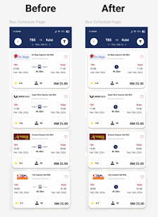 |
| Fig 1.8 Redesigned Bus Schedule Screen |
As part of the design enhancements :
- I replaced the bus icon in the middle of each card with a clock icon to better represent the travel duration. This change helps users instantly associate the value with time rather than mode of transport — which is already clear from the context. The updated icon also improves the semantic accuracy of the design.
- I adjusted the vertical spacing and line height within each card to give the layout a more breathable feel. This small change significantly improves scanability and reduces visual fatigue, especially for users browsing multiple bus options.
 |
| Fig 1.9 Sort & Filter Screen |
-
Sort By and Filter By are cleanly separated by label, layout, and spacing.
-
Using bold headings (like “Time,” “Class,” “Company”) supports user navigation within the modal.
→ This enhances scanability and supports cognitive chunking (Gestalt’s Law of Proximity).
-
Filter chips for time slots, class, and company are visually distinct.
-
Good size, spacing, and button shape for tappable targets on mobile (likely 48px+ height).
→ Adheres to Fitts’ Law and Mobile Accessibility Guidelines.
-
“Cancel” and “Apply” are well-positioned and styled with clear visual hierarchy:
-
“Cancel” in outline
-
“Apply” in filled yellow
-
→ Encourages decisive action and supports Nielsen’s Heuristic: Clearly Marked Exits.
-
Top-left “X” button aligns with thumb reach and common modal dismissal patterns.
→ Follows Jakob’s Law (users prefer familiar UI patterns).
-
Having two “AM” labels (08:00–06:00, 06:00–12:00) is confusing:
-
08:00–06:00 seems like an error or may imply “overnight” filter
-
 |
| Fig 2.0 Redesigned Sort & Filter Screens |
- I replaced the vague “AM/PM” labels with more intuitive terms like Night, Morning, Afternoon, and Evening, along with their respective time ranges (e.g., Night: 00:00–06:00). This change helps users quickly understand and choose the time slots that best match their travel preferences without second-guessing.
 |
| Fig 2.1 Add passenger details screen |
Self Reflection:
-
Provides route, date, operator, time, and duration in a compact, familiar card layout.
-
“1 seat” and “View Details” link allow for quick context without visual overload.
→ Supports Recognition over Recall and offers progressive disclosure.
-
Very clear separation of contact vs passenger
-
The “Add new passenger” button is highly visible and action-oriented
-
Pre-filled example (Winnie Ho, 35 Years Old) gives visual cue of a completed step
→ Strong use of Form Design Best Practices: chunking, prefill, edit-in-place logic
-
Nicely done as an opt-in section, not forced
-
Includes concise info, icons, and a toggle with confirmation options
-
Two clearly distinct choices with radio selection – avoids confusion
→ Supports User Autonomy and adheres to ethical upsell principles
-
Bright yellow button placed at the bottom – ideal position for progressive flow
-
Button label is simple and matches common patterns
→ Aligns with Fitts’ Law and supports flow state interaction
Suggestions For Improvements :
- You currently show 0/1 selected which is not very intuitive, consider changing it to 1/1 passenger selected with a tick icon indicating.
AI Evaluation :
Strengths :
 |
| Fig 2.2 Redesigned Add Passenger Details Screen |
As part of the design enhancements :
- I replaced the generic bus icon in the travel duration section with a clock icon, making it more intuitive and semantically accurate. This better reflects the purpose of the field, which is to display travel time, not transport type.
- I added a green indicator with a checkmark and “1/1 passenger selected” label to show when all required passenger details have been filled in. This creates a clearer sense of completion and reassures users that they’ve fulfilled that part of the process.
- I changed the original line “Tickets would be sent here” to “Tickets would be sent to this e-mail”, which is more direct and user-friendly. This improves the clarity of communication and reduces ambiguity, especially for users unfamiliar with the app.
 |
| Fig 2.3 Payment Details Screen |
Self Reflection :
-
Clearly labeled as “TBS Wallet”, distinct from generic payment screen
-
Reinforces that this is a secure, in-app transaction method
→ Builds trust and matches user expectations (Jakob’s Law)
“210 TBS points would be collected...”
-
Great incentive copy to nudge wallet usage
-
Clear value proposition without being pushy
-
Positions wallet payment as smart and rewarding
→ Aligns with nudge theory and increases perceived value of using the in-app wallet
-
“Ticket Details” and “TBS Savings” are visually distinct but related
-
Highlights:
-
Price (RM 26.00)
-
Savings applied (RM 2.00)
-
Wallet balance before and after
-
→ Follows UX financial transparency principles, which increase trust and reduce drop-off
-
Red typography for total and balance creates attention priority
-
Card layout with adequate spacing aids scannability
→ Aligns with visual hierarchy best practices (especially in fintech contexts)
Suggestions For Improvements :
-
You mention:
-
Ticket total is RM 26.00
-
Deducted amount is RM 2.00 (from wallet)
-
This suggests only points are applied, not full payment.
Suggestions:
-
Rename “Deducted Amount” → “Points Deducted”
-
Add: “Remaining RM 24.00 will be charged to TBS Wallet”
→ Ensures full cost path clarity, avoids misinterpretation
Consider adding a wallet icon beside the "TBS Savings" label or next to the final balance:
-
Helps tie the information to wallet functionality
-
Strengthens brand visual language
 |
| Fig 2.4 Redesigned Payment Details Screen |
As part of the design enhancements :
- I added icons beside the “Ticket Details” and “TBS Savings” section titles to make the content more visually digestible and scannable. These icons help break up text-heavy sections and give users a quick reference point for understanding the breakdown of charges and savings.
- I changed the button label from “Next” to “Confirm & Pay” to reflect the actual action the user is taking at this point in the journey. This change removes ambiguity and sets clearer expectations, reducing potential hesitation or confusion during payment.
 |
| Fig 2.5 My Profile & FAQ |
Self Reflection :
Clear Identity at Top
-
Profile image + name (Xiao Ming) gives a strong user anchor
-
Establishes identity and access point for personalization
-
-
Well-Organized Feature List
-
Uses intuitive icons and recognizable labels (TBS Wallet, Community, FAQ, Settings, etc.)
-
Log Out button is clearly styled in yellow, separate from destructive actions
-
-
Footer Social Links
-
Inclusion of web + social icons subtly encourages external engagement without cluttering UI
-
→ Follows Information Architecture best practices and User Control & Freedom
FAQ & Support Page
Search Bar Placement
-
Top-aligned with icon and placeholder – perfect for FAQ behavior
-
Supports search-first help discovery
-
-
Expandable FAQ Cards
-
Accordion-style interaction is compact and scalable
-
Encourages exploration without overwhelming
-
-
Booking-Specific Issue Reporting
-
Excellent inclusion: shows recent bookings and provides direct “Report” button per trip
-
Anchors user assistance in context
-
→ Demonstrates strong Task-Relevant Support, applying Recognition over Recall
-
Multi-Channel Support
-
“Call Us,” “Chat,” “Feedback,” “Mail” — multiple modalities for varied user preferences
-
Each action visually distinct with icons
-
→ Excellent accessibility and inclusivity
 |
| Fig 2.6 Redesigned My Profile & FAQ Screens |
As part of the design enhancements :
- I introduced an “Edit Profile” button below the user avatar to make profile management more accessible. This gives users direct access to modify their account details, reducing the number of steps needed to reach that functionality — an important UX improvement for user autonomy.
- I adjusted the search bar styling on the FAQ & Support page by lightening its background. This creates a stronger contrast between the search input and the FAQ cards below, making it easier for users to identify the search function and distinguish it from static content.
3. Feedback
4. Reflection


Comments
Post a Comment