1. Early Letterform development : Phoenician to Roman
- People in the past write by using sharpened sticks on wet clay or
carving with a chisel. But as time goes by ( for about 2000 years) ,
uppercase letterforms evolved to a combination of straight lines
and circles.

|
Fig 1.3 Phoenicians votive stele Carthage
|
Meanwhile the figure below shows the timeline of how Phoenician
evolved to form Modern Latin and Early Arabic

|
|
Fig 1.4 Phoenician Evolution Timeline
|
Writing Style :
The Phoenicians wrote from the right to the left but on the other hand
the Greeks wrote from the right to the left and the left to the right
alternately. This unique style of writing is called "boustrophedon".
Both the Greeks and Phoenicians did not have the habit of using
punctuation in their writing. I did a little bit more research on
boustrophedon as I find it very interesting how people in the past
read and write like that. Below is an example of how boustrophedon
works. They have to be fluent in reading words in reverse and I
personally found it a challenge for me.

|
Fig 1.5 Boustrophedon
|

|
|
Fig 1.6 Boustrophedon
|
Direction of letterforms :
Etruscan and Roman both share the similarity of carving in marble
plated forms before inscribing them which will lead to a change in the
quality of strokes and letterform weight.

|
|
Fig 1.7 Phoenician evolution into Greek than Roman
|

|
Fig 1.8 Early Rome Inscription
|
2. Hand-scripts from 3rd century BCE to 10th century BCE
C.E.
Square capitals were being found in Roman monuments in which
serifs were added to the finish of the main strokes. It was achieved
by holding the pen 60 degrees off the perpendicular.

|
Fig 1.9 4th/5th Century Square Capitals
|
Rustic Capitals were the compressed version of
square capitals and it can be found in the Ronan monuments as well.
They are harder to read ( due to its compressed nature ) but easier to
write.

|
|
Fig 1.10 3rd/4th century Rustic Capitals
|
Lowercase Letterforms were used more frequently in
everyday transactions as it is simple and fast to write instead of
Rustic & Roman capitals as they were reserved for more official
documentary purposes. Lowercase letterforms were in cursive
handwriting.

|
|
Fig 1.11 4th century lowercase letterforms
|
Uncials were found in Roman Cursive handwriting
especially in the forms of A,D,E,H,M,U,Q. Compared to normal cursive
handwriting, it is more broad and readable than rustic capitals. It
does not have uppercase and lowercase but it is normally understood as
small letters.

|
|
Fig 1.12 4th/5th century Uncials
|
Half uncials were further refined from cursive
handwriting and it marked the beginning of lowercase letterforms by
using ascenders and descenders.

|
|
Fig 1.13 Half uncials
|
Standardized Calligraphy
The Alcuin of York and Abbot of St Martin of Tours were entrusted by
Charlemagne, the first unifier of Europe since the romans to
standardize all ecclesiastical texts. They used masjuscules
(uppercase) , miniscule , capitalization and punctuation to set the
standard of calligraphy.

|
|
Fig 1.14 Caroline miniscule
|
3. Blackletter to Gutenberg's Type
After Charlemagne's empire is dissolved, there came regional variations
upon Alcuin's script.
Blackletter ( textura ) gained popularity in the Northern Europe ,
it is known to be more condensed and vertical.

|
|
Fig 1.15 Textura Blackletter in 1400s
|
In the Southern Europe, a rounded more open hand gained popularity
called the rotunda

|
|
Fig 1.16 Rotunda Blackletter
|
Gutenberg marshalled them to build pages that will mimic the scribe's
hands which is the Blackletter of Northern Europe. He invented the
movable type printing press which led to information revolution. His
many inventions include oil based ink for book printing, adjustable
molds and wooden printing press.

|
|
Fig 1.17 Johannes Gutenberg
|
4. Text Type Classification
I did a summary of the different text type classifications introduced
by Mr Vinod in the figure below.

|
Fig 1.18 Summary of text type classification
|
Lecture 3 : Typo_3_Text P1
1. Tracking : Kerning & Letterspacing
Kerning : Adjustment of space between letters, commonly misunderstood
as letter spacing. However, letter spacing is the additional of spacing
between letters. Kerning and letterspacing is normally used in headlines
and uppercase letters.

|
|
Fig 1.19 With & Without Kerning, Week 2 (10/4/2023)
|
Tracking : Additional and removal of space in a word or sentence.
Tracking is normally used in large text. Normal tracking is used in
large paragraph of texts as the readability is high but lose tracking
and tight tracking will reduce the readability of the words as readers
recognize the counterform of space in between the strokes hence it is
not suitable for large paragraphs of text.

|
|
Fig 1.20 Normal,Tight & Loose Tracking , Week 2 (10/4/2023)
|
Lowercase letters are not suitable for letter spacing and loose
tracking as it is difficult for it to stand on its own, they still
depend on the counterform created between letters to maintain the line
of reading but uppercase letters can stand on their own.

|
|
Fig 1.21 Normal VS Loose Tracking , Week 2 (10/4/2023)
|

|
|
Fig 1.22 Tight Tracking , Week 2 (10/4/2023)
|
2. Alignment/ Formatting Of Text
Flush left : Closely mirrors our handwriting and its the format that
closely resembles the asymmetrical experience of handwriting. Constant
spacing is used throughout the text, allowing to create an even grey
value. Grey value refers to text on white page. However, flush left will
result in a ragged right, it is important to make the ragged right look
smoother.

|
|
Fig 1.33 Flush Left, Week 2 (10/4/2023)
|
Centered : Imposes symmetry upon the text and resulting in equal value
& weight between the left and right ends. This format will transform
text into shape hence it is important to amend the breaks to not result
in it looking too jagged. Centered format is normally found in small
paragraphs , not long paragraphs as it is hard to read.

|
|
Fig 1.34 Centered , Week 2 (10/4/2023)
|
Flush Right : Places emphasis on the ends of line, commonly found in
captions where the relationship between text and pictorial might be
ambiguous without strong orientation from left to right.

|
|
Fig 1.35 Flush Right , Week 2 (10/4/2023)
|
Justified : Letterspacing and kerning needs to be used more in
justified. It Imposes a symmetrical shape on text just like the centered
format, it can be done by expanding or reducing the spaces between
words. It produces white space in between and careful attention to line
space/hypen is needed to fix this issue.

|
|
Fig 1.36 Justified , Week 2 (10/4/2023)
|
It is important for designers to keep in mind when settling the field
of text , that readability and clear presentation is the top
consideration. We need to find a balance between creativity and
readability.
3. Texture
It is imperative to consider the different textures related to the
typefaces. Type that has high x-height and heavy stroke width produces a
darker mass on the page compared to the small x-heights or lighter
stroke. Putting consideration into these differences are the basis of
creating good layouts.

|
|
Fig 1.37 Anatomy of Typeface , Week 2 (10/4/2023)
|
Differences between grey value can be easily spotted in the variation
of typefaces.

|
|
Fig 1.38 Different typefaces show different grey values , Week
2 (10/4/2023)
|
4. Leading & Line Length
The main goal for setting text type is readability and easy prolonged
reading.
Type size - Should be big enough to read easily from arm's
length
Leading- The spaces between the adjacent lines of the typeface

|
|
Fig 1.39 Tight VS Loose Leading , Week 2 (10/4/2023)
|

|
|
Fig 1.40 Variation of Leading in Adobe Janson Pro , Week 2
(10/4/2023)
|
Line Length - Number of characters in a line, ideally we should keep it
at 55-65 characters.

|
|
Fig 1.41 Line Length Board , Week 2 (10/4/2023)
|
5. Type Specimen Book
It shows samples of typefaces in variation size. It is used for
designers to accurately judge and make a choice on which typefaces is
suitable. Factors to take into considerations are the type size, line
length , leading etc.

|
|
Fig 1.42 Sample type specimen book , Week 2 (10/4/2023)
|
Compositional Requirement : Text should create a field to occupy
the page, the best text should have middle grey value.
It is a good practice to enlarge it up to 400% on screen to get a clear
view on the descenders on one line and the ascenders on the line
below.
Lecture 4 : Typo_Text_P2
1. Indicating Paragraphs
Mr Vinod introduced some methods to clearly indicate paragraphs.
Pilcrow: This is a holdover from medieval manuscripts seldom use today.
It is considered as a hidden character or blue indicator that will aid
in formatting large amount of text.

|
|
Fig 1.43 The Pilcrow , Week 3 (10/11/2023)
|
Line Spacing (leading) : Paragraph space should be the same as the line
space, this will ensure cross alignment across columns of text. The
difference between line space and leading is that, line space is the
space from the baseline of a sentence to the descender of the next
sentence. Leading is the space between two sentences.
It is remember to note that design students use the term leading in
typography.

|
|
Fig 1.44 Leading vs Line Space , Week 3 (10/11/2023)
|
Indentation : Normal indentation is the indent of the first line in the
paragraph. The ident is the same size of line spacing or the same point
as the line of the text.

|
|
Fig 1.45 Standard Indentation , Week 3 (10/11/2023)
|
2. Widows & Orphans
The two unpardonable gifts in designing and formatting text is widow
and orphan. Widow is a short line of text left alone at the end of the
column text and orphan is the short line of text left alone at the start
of the column text.
Designers that deal with huge amount of texts, typically magazine
designers must take extra care of this.

|
|
Fig 1.46 Widows & Orphans , Week 3 (10/11/2023)
|
3. Highlighting Text
Some of the methods to highlight text includes :
-Use the same typeface with varying font ( Italic , Bold , Semi Bold
etc ) or different color

|
Fig 1.47 Italic , Bold , Color , Week 3 (10/11/2023)
|
-Use Bold Sans Serif : As serif fonts are larger than non serifs in the
same point size. In this picture, the sans serif font Univers has been
reduced 0.5 times to match the x height of the serif font.

|
|
Fig 1.48 Bold Sans Serif , Week 3 (10/11/2023)
|
-Place a field of color can highlight the text and make it stand out,
keep in mind to maintain the left reading axis to ensure the readability
of text.

|
|
Fig 1.49 Highlighting Text with Box , Week 3 (10/11/2023)
|
-Place typographic elements such as bullet points and quotation
marks

|
|
Fig 1.50 Typographic elements , Week 3 (10/11/2023)
|
4. Headline Within Text
There are certain subdivisions within a text of the chapter, I have
divided them into 3 parts , A , B & C based on the level of
importance. Visual hierarchy is important for designers to express the
different importance of text
A head being the most important will indicate a clear break between
topics with sections .

|
|
Fig 1.51 A headline text, Week 3 (10/11/2023)
|
B are subordinates to A heads which indicates a new supporting document
or argument for the topic at hand.

|
|
Fig 1.52 B headline text , Week 3 (10/11/2023)
|
C highlights specific facets of materials within the B headline text, C
heads in the configuration are followed by at least an em space for
visual separation.

|
|
Fig 1.53 C headline text , Week 3 (10/11/2023)
|
5. Cross Alignments
Cross aligning headlines or text will aid in reinforcing the
architectural sense of the page while articulating the complimentary
visual rhythms. This example shows one headline type cross aligns with
two lines of text.

|
|
Fig 1.54 Cross Alignments of Text , Week 3 (10/11/2023)
|
Lecture 5 : Type_4_Text_Basic
1. Describing Letterforms
It is important for us to know how to identify letterform's component
parts for us to tell the specific typefaces. Below are some crucial
components we need to know,
- Baseline : The imaginary line the visual base of the
letterforms
- Median : The imaginary line defining the x-height of the
letterforms
- X height : The height in any typeface of the lowercase 'x'
- Stroke : Any line that defines the basic letterform
- Apex/Vertex : Point created by joining two diagonal stems ( apex on
the top and vertex at the bottom )
- Arm : Short strokes off the stem of the letterform , either
horizontal (E,L,F) or inclined upwards (X,Y)
- Ascender : The portion of the stem of a lowercase letterform that
projects above the median
- Barb : The half serif finished on some curved stroke
- Beak : The half serif finished on the same horizontal arms
- Bowl : The rounded form that describes a counter
- Bracket : The transition between the serif and the stem
- Cross bar : The horizontal stroke of the letterform that joins two
stems together
- Cross stroke : The horizontal stroke of the letterform that joins two
stems together
- Crotch : The interior space where two strokes meet
- Ear : The stroke extending out from the main stem or body of the
letterform
- Descender : The portion of stem of a lowercase that projects below
baseline
- Em/en : Originally referred to the width of uppercase 'M' , em is now
the distance equal to the size of the typeface , and en is half the size
of em
- Finial : Rounded non serif terminal to the stroke
- Leg : Short stroke off the stem of letterform ( at bottom L,
inclinced downwards K,R)
- Ligature : Character formed by combination of 2 or more
letterforms
- Link : The stroke that connects the bowl and loop of lowercase
'G'
- Loop : Bowl created in the descender of lowercase 'G'
- Serif : The right angled or oblique foot at the end of the
stroke
- Shoulder : The curved stroke that is not part of the bowl
- Spine : Curved stem of 'S'
- Spur : The extension that articulated the junction of the curved and
rectilinear stroke
- Stem : The significant vertical or oblique stroke
- Stress : Orientation of the letterform, indicated by thin strokes in
round forms
- Swash : The flourish that extends the stroke of the
letterform
- Tail : Curved diagonal stroke at the finished of certain
letterforms
- Terminal : The self contained finish of a store without a serif , it
can be flat , flared , acute , grave , concave or rounded as a ball or
teardrop

|
|
Fig 1.55 Describing Letterforms , Week 4 (10/19/2023)
|
2. The Font
The full font of a typeface has more than 26 letters, we are needed to
know how to work with a full font and how to use it.
-Uppercase : Capital letters, containing certain accented vowels
-Lowercase : Includes same character as uppercase
- Small capitals : Uppercase letterforms drawn to x height of
typeface

|
|
Fig 1.56 Uppercase & Lowercase , Week 4 (10/19/2023)
|
-Uppercase Numerals : Also known as lining figures, they have same
height as uppercase letters and set to the same kerning
width
-Lowercase Numerals : Also known as old stye figures or text figures,
they are set to the same x height of ascenders & descenders

|
|
Fig 1.57 Upper and Lowercase Numerals , Week 4
(10/19/2023)
|
-Italic : The form in italic referred back to 15th century italian
cursive handwriting, oblique is based on the roman form of this
typeface
-Punctuation, miscellaneous characters : Can vary from typeface to
typeface , it is vital to be familarised with the characters in a
typeface before choosing a right type for the right job
-Ornaments : Used as flourishes in invitations or certificates ,
usually provided as a font in a larger typeface

|
|
Fig 1.58 Punctuation, miscellaneous characters & ornaments
, Week 4 (10/19/2023)
|
3. Describing Typefaces
Mr Vinod introduced some typefaces & their stroke and widths
-Roman : Their uppercase fonts derived from inscriptions of Roman
monuments. A slightly higher stroke in Roman is known as 'book'
.
-Italic : Named after 15th century italian handwriting
-Boldface : Characterized by a thicker stroke than a roman form ,
depending on their relative strokes, the name can vary from bold to
semibold to medium, black and extrabold.
-Light : A lighter stroke than Roman , even lighter strokes are called
'thin'
-Condense : A version from roman form, extreme condensed styles are
called 'compressed'
-Extended : An extended variation of roman font

|
|
Fig 1.59 Different Typefaces , Week 4 (10/19/2023)
|
4. Comparing Typefaces
The 10 typefaces given to us by Mr Vinod represents 500 years of type
design and the goal is to achieve high readability and an appropriate
expression of contemporary aesthetics. Different typefaces are to be
used in different tasks as each of them evokes a different sense and
expression, we are to understand the typefaces well and pick a suitable
typeface for every task.

|
|
Fig 1.60 The 10 typefaces , Week 4 (10/19/2023)
|
2. INSTRUCTIONS
Task 1 : Exercise 1 & 2
3. Task 1 : Exercise 1 - Type Expression
For exercise 1, Mr Vinod allowed us to give our suggestions on what
words we would like to try to do for Type Expression. After poll voting,
we had to choose 4 words out of these 8 words which are :
Coph-Chop; Windy; Dive; Stab; Roar; Illusion; Huge;
Shock.
Our first task was to come up with at least 3 to 4 sketches on what we
would imagine the type expression to look like. The class was encouraged
not to spent too much time on 1 sketch as the main point was to be fast
and allow more ideas to flow in.
1. Research
I went to search on what exactly is typography expression - It is a
creative strategy to blend and merges the use of visual communication.
It is a type that not only say words but also communicate concepts
across too. To kick off, I went to behance and searched for typography
expression examples
This evokes a feeling of sorrow and loneliness and feeling too
much melancholy will cause you to lose yourself and fall into pieces as
described in this typography expression.
This evokes a sense of excitedness and happiness as the alphabets
are designed to be on different levels. I noticed that some shadows were
also added to mimic the shadows of bouncing. The letter is perfectly
described in this typography expression.
The use of negative space here is being reduced and it evokes the
feeling of being trapped in a very small environment , and
tightness.
After looking at a few examples of typography expressions, i
summarised a few takeaways on how to create a effective typography
expression :
- Scale : The size of the alphabets can express different meanings.
For example a big scale alphabet can express different concepts
compared to a small scaled letter.
- Shape : We can link the idea of a shape that comes to our mind when
we want to express something. For example when I think of box, the
first shape that comes to mind is a square.
- Lines: Wavy or straight lines express differently, wavy lines comes
in bents , curves etc while straight lines has no movement
2 . Sketches
I picked the words Windy,Dive,Shock & Illusion for the type
expression task as I found these words very interesting and there were
many variations to play with.

|
|
Fig 3.2.1 Dive First Sketch , Week 1 (27/9/2023)
|
A) Dive Sketch #1 : I designed the "ive" to be -45 degrees
facing down to mimic an object diving downwards.
B) Dive Sketch #2 : The "i" is designed to be falling inwards into the
word to mimic a person diving down.
C) Dive Sketch #3: The "i" is designed to be overlapping the empty
space of the letter "D" . With the dot on the "i" entering and
followed by the alphabets "v" and "e" to illustrate the alphabets
diving inwards.
D) Dive Sketch #4: The alphabets "ive" is designed to be overlapping
each other in a bundle. Spacing was put between the alphabet "D" and
the rest to mimic the alphabets diving down one after
another.

|
|
Fig 3.2.2 Illusion First Sketch , Week 1 (27/9/2023)
|
A) Illusion Sketch #1 : The "s" is designed to be
invisible but it can be told from the design of the rest of the
letters.
B) Illusion Sketch #2 : The "u" and "o" is designed to be invisible
here just like an illusion.
C) Illusion Sketch #3 : I envisioned the word to have a cracking
effect to convey a message "Everything you knew was an illusion" and
the word cracks like a mirror.
D) Illusion Sketch #4: The word is designed to be in a circle
spinning infinitely, conveying a message that one is never going to
wake up from the illusion as you go in circles.

|
|
Fig 3.2.3 Shock First Sketch , Week 1 (27/9/2023)
|
A) Shock Sketch #1 : This is designed reference to the question
mark logo "?" . The alphabets "S', "H' , "O" , "C" makes up the curve of
the question mark while the "K' acts as the dot. This is to perceive the
idea of shock.
B)Shock Sketch #2 : This is designed to convey the idea of
someone gradually realizing something and feeling shock. The size of
the alphabets increases gradually.
C) Shock Sketch #3 : I envisioned the alphabet "O" to look like a
human mouth, portraying the idea of shock.
D) Shock Sketch #4: The "O" is made to be 3D instead of 2D to
emphasize on it looking like a eye .

|
|
Fig 3.2.4 Windy First Sketch , Week 1 (27/9/2023)
|
A) Windy Sketch #1 : This is designed reference to the wind blowing the
alphabets away from each other. The alphabets are arranged in a random
manner mimicking the motion of wind.
B) Windy Sketch #2 : The last letter "y" is designed to be
blown away with it appearing 3 times.
C) Windy Sketch #3 : The letters are arranged in the shape of
the wind spiral and the wind is blowing away one alphabet from each
layer. The letters are fading one after another.
D) Windy Sketch #4: The dot on the alphabet "i" is designed to be
blown away by the wind
3. Digitalization
In the process of digitalizing , I tried out several of my sketches
and also some new designs after feedbacks from Ms Hsin. I attempted
many times by playing around with the fonts, arrangements of
alphabets and the typefaces. After filtering the best word from each
of the rough digitalization, I put in more details and effort to
attain the final looks. I recorded the main processes of the
digitalization of each word below.

|
|
Fig 3.3.1 Rough Digitalization , Week 2 (10/3/2023)
|
A ) Illusion

|
|
Fig 3.3.2 Illusion Design Process, Week 2
(10/3/2023)
|
I picked the font
ITC Garamond Std Ultra Condensed Italic because it gives me a
wavy texture and creates a good spiral outlook just like how i
envisioned it to be. Initially I started off with only one loop of
illusion but during the process and after discussion with Mr Vinod,
I made it 3 loops of illusion to portray the never ending spiral of
getting caught in an illusion.
B ) Dive

|
|
Fig 3.3.3 Dive Design Process , Week 2 (10/3/2023)
|
I picked the font Adobe Calson Pro Regular for the final
design but started out with Gill Sans MT Bold . The reason
why I changed font was because most of the designs I tried out was
sans serif style so i wanted to give serif fonts a try and it turned
out quite well. I mainly adjusted the position of letter "i" to give
an impression of it diving inwards to the letter.
C ) Windy

|
|
Fig 3.3.4 Windy Design Process , Week 2 (10/3/2023)
|
I picked the font Univers LT Std 85 Extra Black for the
final design but started out with Gill Sans MT Italic. I
changed font over the design process because I find that it does not
have enough volume and does not give off the "tornado spiral wind"
feel. Making it wider and broader will add volume to the whole
design.
D ) Shock

|
|
Fig 3.3.5 Shock Design Process , Week 2 (10/3/2023)
|
I picked the font Janson Text LT Std 55 Roman for this
design. I mainly play with the size contrast of the alphabet "O" and
its positioning. The first design has clear contrast in size but the
white space left is too much so i rearranged the alphabets to fill
up more space to properly give off the feeling of shock.
Final
Task 1 : Type Expression

|
Figure 3.3.6 Final Type Expression , JPEG , Week 2
(10/3/2023)
|
Figure 3.3.7 Final Type Expression , PDF , Week 2
(10/3/2023)
After that, we were instructed to choose one out of four words to
animate into a GIF . Initially I did Windy but Ms Hsin felt that
illusion would be more interesting.

|
|
Fig 3.3.8 Windy Frames , Week 3 (10/10/2023)
|

|
|
Fig 3.3.9 Windy GIF , Week 3 (10/10/2023)
|
For illusion, in order to bring out the effect of the words spinning
, I added more layers to it. For each layer, I rotated the word
clockwise and anticlockwise by a difference of 30 degrees each. After
that I imported the frames into photoshop and made each screen
0.1s.

|
|
Fig 3.3.10 Illusion Frames , Week 3 (10/10/2023)
|
Final Animated Task Expression :

|
|
Fig 3.3.11 Illusion Final GIF, Week 3 (10/10/2023)
|
4. Task 1 : Exercise 2 - Text
Formatting
For Exercise 2, we were required to work with kerning , tracking ,
typefaces , line length etc and create layouts using text
formatting.
1. Kerning and Tracking exercise
Mr Vinod instructed us to work with kerning and tracking of our own
name using the 10 typefaces he provides us with. We were also given
flexibility to choose the fonts and sizes in the
typefaces.
.jpg)
|
|
Fig 4.1 Name with Kerning , Week 4 (10/17/2023)
|
.jpg)
|
|
Fig 4.2 Name without Kerning , Week 4 (10/17/2023)
|
.png)
|
|
Fig 4.3 Difference with & without kerning , Week 4
(10/17/2023)
|
2. Text Layout Exercise ( I am Helvetica )
For this exercise, Mr Vinod gave us an abstract of " I am Helvetica" by
John Doe. We needed to create a layout with the text given and insert
our own chosen picture (related to the text given) and give it a
caption. We will be familarised on how to make a good layout and deeper
understanding on text formatting.
I created 5 digital layouts with different typefaces and different
columns but all of them are left aligned.

|
|
Fig 4.4 Different Digital Layouts , Week 4
(10/18/2023)
|
Among all these layouts, I personally prefer layout #2 as it is more
straightforward and easy to read. I further worked on refining layout
#2.

|
|
Fig 4.5 Rough Layout #2 , Week 4 (10/18/2023)
|
Here are the design process I recorded for Layout #2 :
1) I changed the leading to 10pt and body text type at 8pt to achieve
ideal line length at 50

|
|
Fig 4.6 Adjusted body text type & leading , Week 4
(10/18/2023)
|
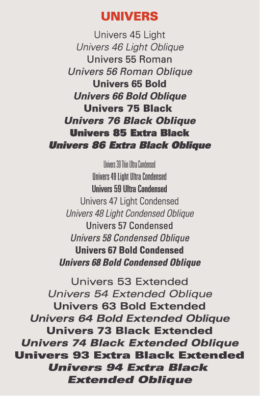
2) I adjusted the body text typeface to Univers LT as it has a higher
readability in a paragraph and used Roman 55

|
|
Fig 4.7 Body text typeface changed to Univers LT , Week 4
(10/18/2023)
|
3) Hypenation was being turned off in the body text

|
|
Fig 4.8 Hypenation is turned off , Week 4 (10/18/2023)
|
4) Kerning work done on body text

|
|
Fig 4.9 Before and after kerning of body text , Week 4
(10/18/2023)
|
5) I noticed there is some widows and orphans so I adjusted
it

|
|
Fig 5.0 Fixed text without widows and orphans , Week 4 (10/18/2023)
|
Week 2
General Feedback : After taking a first look at our blogs, Mr Vinod
reminded us to put in the dates in the description of our figures. For
the sketchings, we were told not to rely too much on pictorials and
illustration to bring out the effect of the text.
Specific Feedback : Blog is well done, for the sketches especially
"shock" try to explore more options, other than that, other words are
good to go for digitalization. For the illustration digitalization,
consider adding more layers to it as it gives off a stronger
feel.
Week 3
General Feedback : Reflection and feedbacks need to be constantly
updated, it will be a good practice to always label our
images.
Specific Feedback : Blog is on track, for the animated gif task , Ms
Hsin suggest to try illusion instead of Windy. Try to adjust the degree
of the text to give it a spinning effect and shorten the time of each
frame . Mr Vinod suggested that i can add more layers of illusion text
to the gif. Overall, final gif looks well done.
Week 4
General Feedback : GIF needs to look smooth and avoid adding too much
unnesscary frames, remember to constantly update design
process.
Specific Feedback : Blog is on track, can move on to the next exercise
which is task formatting.
Week 5
General Feedback : Try not to put images that are too big that will overshadow the importance of the text and choose a font that has good readability for body text.
Specific Feedback : The layout for my exercise 2 "I am Helvetica" is
interesting as I am using irregularity to layout the texts. Ms Hsin
commented that my byline can consider a different arrangement and the
caption should be longer to so it is easy to recognize.
Reflection
Experience : It was very interesting to learn how typography evolves
overtime and i found that the type expression exercise is a little
challenging as we only can use the fonts provided and we had to express
the meaning of the words out without illustrations. I completed the
tasks week by week and throughout the weeks, the work has been pretty
intense but enjoyable as well. I looked at my classmates work and also
gain feedbacks from Mr Vinod & Ms Hsin to improve my own
work.
Observations : I observed the importance of being on track each week as
we moved on from our previous task weeks after weeks and the tasks are
all linked up together. We need to constantly be proactive in getting feedback and do not be afraid of asking questions. I realized that the details shared in the lectures can be used in our tasks and that we should observe small details in all our work.
Findings : Typography is seen everywhere we go but before I learnt about it in depth, i did not look into it much when i walk past banners, designs that has varying typography. I found that each typeface has its own uniqueness and expressions and it requires a lot of detailed work and research in order to create an impactful type design. After learning typography, I tend to pay more attention to the different typefaces I observed in my daily lives and will ponder at the back of my mind "why" and "how" the designer chose this typeface for this particular objective.
I also find that I should spend lesser time trying to perfect my work in the beginning of a task as design needs to be constantly improved overtime and not achieve perfection in one go. I will learn how to better manage my time for other modules and tasks moving ahead.
Further Reading
Fontology is the website recommended by Mr Vinod in his lectures , the
contents here described the foundational elements of fonts. It is split
into 3 modules - Type History, Type Anatomy & Type Families.
Type History - Ancient Roman Capitals were mainly used to
bring across the concepts of respect, elegance and of upmost importance
, but rarely used in the daily normal lives. Overtime it evolved to be
able to serve less epic purposes. Easier writing styles emerged as
scribes wrote the words by hand instead of using stones to carve out the
words. The 3 distinct handwriting styles back then were square capitals
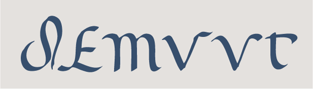
, Roman cursive and rustic capitals.

|
Square Capitals
|
|
|
Roman Cursive
|
|
|
Rustic Capitals
|
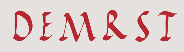
Type Anatomy - This module taught me the basics of typefaces and the need to
appreciate the fundamental tools before we can use typography well. Some
of the type anatomies includes :
- Small Caps : They are called the small uppercaps that share the same
height as a lowercase and shorter than a normal uppercase. Because of
it's size, it enables them to harmonize well with both small caps and
big caps.
|
|
Small Caps Example
|
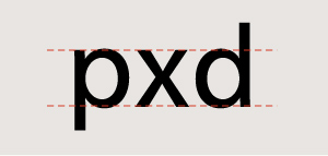
- X height : It is described as the height of a lowercase letter at any
given typeface and size. People normally confused the X height with the
point size. Point size is described as a measure of its overall
height.
|
|
X Height Example
|
Letters with a higher X-height tends to be more visible than low
X-heights. X heights can vary from different typefaces.

|
|
Typefaces with varying X-Heights
|
- Weight , Proportion & Texture : These are the 3 main
characteristics that can distinguish one typeface from the
other.
Weight refers to bold, light , medium , extrabold etc of a typeface
design .
Proportion refers to the width of a character in relation to the
height , some examples includes condensed, extended , extra condensed
.
Texture refers to the different surface textures of each
typeface.

|
|
Difference between the 3 anatomies
|
Type Families - This module taught me
how typeface families were introduced by pairing roman and italic
designs that matched each other in style. Typeface of the same family
will share the basic characteristics with the parent design but each
with their own unique point.
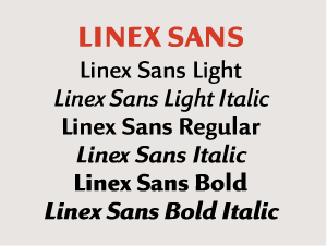
|
|
Typical Typeface Family
|
The font families has different variations including planned by numbers
, extended type and size specific type.
Planning by numbers- Each typeface will have 2 suffix digits. With the
first digit meaning alphabet weight. 3 is indicated as the lightest and
9 as the boldest. Second digit will mean the typeface proportion with
higher numbers as condensed design and lowest as expanded designs. In
addition, if the second digit is odd, it is a roman design , if it is
even it is classified as italic design
Extended Type Families : Some families will be made up of a mixed of
Serif, Sans Serif and etc (two or more sub families ) . ITC Stone is
an example of extended typeface family as it is made of up of 4 types.
( Serif , Sans , Humanistic and Informal ).

|
|
ITC Stone Example
|
Size Specific Families : It is made up of different designs and sizes
used at different occasions. Below is an example , namely ITC Bodoni
which comprises of 3 different size variants named
6,12,72.
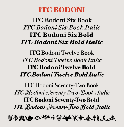
|
|
ITC Bodoni Example
|
Back to the top ^
QUICK LINKS 


.jpg)
.jpg)
.png)


Comments
Post a Comment