Application Design 2 - Task 3 : Interactive Component Design & Development
21/04/2025 - ( Week 7 - Week 11 )
Ho Winnie / 0364866
Application Design 2 / Bachelor's of Design Honors In Creative Media
Task 3 : Interactive Component Design & Development
Purpose:
Welcome new users with a lively, branded micro-interaction that makes your onboarding feel smooth and polished.
Visual Idea:
-
A bus icon subtly moves or transforms when the user taps Get Started or Next.
-
Use TBS brand colors for familiarity.
-
Should loop smoothly or play once on tap.
Purpose:
Smoothly bridge from onboarding or login into the Home screen — instead of an abrupt switch.
Visual Idea:
-
A bus driving into the screen → fades into the Home page.
When Used:
-
After onboarding completes.
 |
| Fig 1.3 Progression in Lottiefiles |
Purpose:
Make my loyalty/points system feel rewarding and satisfying with an animation
Visual Idea:
-
Animated coins or tickets flow into a wallet or balance bar.
-
Can use a small tick animation when redemption succeeds.
When Used:
-
When the user taps Redeem Points and the API call succeeds.
Purpose:
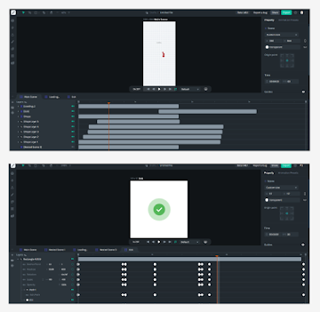
Close the purchase flow with a feel-good moment — signals trust and success.
Visual Idea:
-
Animated circle loading animation spins and pops with a green check.
When Used:
-
After payment success screen loads.
Container that visually separates the sheet from the main page and gives it that familiar slide-up modal feel. Inside this, a single Column neatly stacks the header, search field, and the two destination lists in a clear top-to-bottom flow.The top section features a bold Departure Destination title and a rounded TextField where users can type to search for more locations. Below that, I created the Recent Destinations and Popular Destinations sections using multiple Rows inside the Column. Each destination line combines an icon, a clear text label for the city or route, and a quick action text like Route or Alight At that stands out in my brand’s accent color. Dividers between sections help keep everything organized and easy to scan.
 |
| Fig 1.9 Choose Destination Pop Up |
For my Select Date popup, I created a reusable bottom sheet Component in FlutterFlow to keep the booking flow clean and consistent. The outer Container has rounded top corners, giving it a smooth modal look that feels familiar and easy to interact with. Inside this, I used a single Column to stack the title, the month navigation bar, and the full interactive calendar grid.
At the top, there’s a header section with the Select Date title styled in my primary accent color. Below it, a simple Row holds left and right arrow Icons for switching months and a Text widget showing the current month and year. This structure makes it clear and easy for users to flip between months without leaving the popup.
The main part of this popup is the calendar grid. Each day is built with a Column containing the day name, the fare (RM30), and the date number itself. All the date numbers are implemented as individual Buttons — this way, users can tap any date to select it instantly.
 |
| Fig 2.0 Choose Date Pop Up |
C. Designing The Pages In Flutterflow
For my MVP prototype, I decided to focus on building the core user journey that brings the TBS app to life end-to-end. This includes a smooth splash screen, a clean login flow, and an engaging onboarding experience to introduce new users to the app’s key features.
Beyond onboarding, I mapped out the entire booking process, covering everything a user needs to easily buy a bus ticket. This includes browsing available buses, using sort and filter options, redeeming loyalty points for discounts, and completing the purchase with a simple, reassuring payment flow.
I built this login screen with a clean layout showing the TBS logo, email and password fields, a Sign In button, and quick social login options at the bottom — all organized in the Widget Tree for easy control. For extra polish, I added entrance animations using the Animation Panel, combining scale, fade, and slide effects so elements appear smoothly when the page loads.
When the Sign In button is tapped, the Action Panel runs a Navigate To OnboardingPage1 action with a fade transition, giving users a seamless move from login to onboarding. This keeps the experience modern and makes the prototype feel like a real app flow.
 |
| Fig 2.2 Build Process for Login Screen |
3. Onboarding Screens
I designed this onboarding flow with three screens, each showing a hero image, clear welcome text, and simple Next or Get Started buttons to guide the user step by step. The Widget Tree keeps the layout organized with Columns and Containers to hold images, text, and buttons cleanly.
For a smooth, modern feel, I added slide and fade animations in the Animation Panel so each screen’s content slides in and fades as the user progresses. This makes the onboarding feel lively and easy to follow.
Finally, I used the Action Panel to link the last button to the transition home page on the final onboarding animation page with a delay action.
 |
| Fig 2.3 Build Process for Onboarding Pages |
4. Home Page
I designed the home page to help users quickly book their next trip and see important details at a glance. The top shows the TBS E-Wallet balance and quick actions, followed by easy-to-use input fields for destinations, travel dates, and passenger count.
In the Widget Tree, I organized each section in Containers and Rows to keep the layout neat. To display active tickets and promotions, I used ListViews so these items scroll horizontally, making the content easy to browse without crowding the screen.
 |
| Fig 2.4 Build Process for Home Page |
5. Bus Schedule
I designed this bus schedule screen to show a list of bus options with clear info like departure time, duration, price, and ratings. Each bus card includes a Toggle Icon (heart) for users to mark favorites.
To handle the toggle, I created local page state variables (firstbus, secondbus, etc.) that switch each heart icon on and off when tapped. The Widget Tree keeps each card organized with Rows and Columns for images, text, and the toggle icon.
I also added a simple slide-in animation so the bus list appears smoothly when the page loads — making the browsing experience look clean and dynamic.
 |
| Fig 2.5 Build Process for Bus Schedule Page |
6. Sort & Filter
I built this Sort & Filter screen to let users easily narrow down their bus search. The page uses local page state variables (IsPriceSelected, IsBestRated, etc.) to activate tick icons when users select sorting or filtering options.
In the Widget Tree, I used Rows and Columns to group checkboxes, filter tags, and time slots neatly. Each option uses a ToggleIcon that links to its state variable to show a tick when active.
A subtle slide-in animation makes the whole panel appear smoothly from the bottom, giving it a polished, responsive feel when users open the filter.
 |
| Fig 2.6 Build Process for Sort & Filter Page |
7. Seat Selection
This Seat Selection screen shows users the bus layout so they can pick their seats visually. I structured the seats in the Widget Tree using Rows and Containers for each seat number, grouped inside a Column for easy alignment.
Each seat is designed as a Button or clickable Container with custom hover states and colors to indicate availability (Available, Booked, Female, Selected). I used the Button Hover Style to change the seat’s look when tapped or hovered, giving instant visual feedback.
Finally, a smooth scale animation makes the seat grid appear naturally when the page loads, giving the interaction a polished and responsive feel.
 |
| Fig 2.7 Build Process for Seat Selection Page |
This Seat Details page allows users to review their bus details and manage passenger information before checkout. I arranged the layout in the Widget Tree using Stacks, Columns, and Rows for clear separation of sections like contact details, passenger details, and travel insurance add-ons.
For adding a passenger, I built a dedicated Component popup where users can enter name and age, keeping the main page clean and reusable. Animations like scale and fade make the transition smooth when the popup appears, providing a polished user flow.
 |
| Fig 2.8 Build Process for Seat Selection Page |
9. Redeem Points
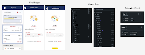
For the Redeem Points and Payment Details flow, I designed simple but clear pages to guide users through redeeming their TBS E-Points rewards and finalizing payment. In the Widget Tree, I structured the pages with a clean Stack and nested Columns for organized text blocks, input fields, and clear reward visuals.
The interaction includes fade and rotate animations to make the transition between reward confirmation and payment feel lively yet smooth. I also used consistent styling for the redeem input, current wallet balance, and the redeem button to maintain user trust at checkout.
 |
| Fig 2.9 Build Process for Redeem Points Page |
10. Payment Details Confirmation
This Payment Details confirmation page clearly summarizes the final breakdown of ticket costs, TBS wallet savings, and applied reward points before the user pays. In the Widget Tree, I used a Stack with a nested Column to arrange the ticket details, savings summary, and a clear call-to-action button at the bottom.
A fade animation smoothens the page entry, making the transition feel more polished. The final confirmation button stands out with a bright highlight, giving users confidence when they proceed to pay.
 |
| Fig 3.0 Build Process for Payment Details Page |
Features completed & features yet to be completed :
The main functionality of the ticket booking process — which represents the core Minimum Viable Product (MVP) for this project — has already been successfully completed. This includes the essential screens and flows for searching, sorting, selecting, and purchasing bus tickets, which form the foundation of the user journey.
Moving forward, the next focus areas are the profile and ticket management sections, which will complete the user experience and provide necessary supporting features.
For the ticket section, I plan to design the boarding ticket layout so that users have a clear and easy-to-scan digital ticket when boarding their bus. Additionally, I will develop the screens where users can conveniently view all their upcoming trips as well as access their past tickets for reference or future bookings. This will help users keep track of their travel history and ensure they have all ticket details readily available.
For the profile section, I will focus on implementing a comprehensive FAQ feature. This will include an interactive accordion or dropdown system that allows users to expand and collapse answers to the most frequently asked questions. The goal is to help users quickly find answers to common inquiries about ticket purchases, payments, refunds, or other app functionalities — reducing friction and potential support requests.
For my navigation bottom bar, I am still trying to build a similar effect as the one I built in Figma but I am facing some issues with the animation that makes it smooth.
Final Submissions :
Flutter Web Deploy App : https://tbsapp-winnie.flutterflow.app/ (Please inspect and view in mobile size which is 393 x 852)
Walkthrough Prototype Video :
2. Feedback
3. Reflection


Comments
Post a Comment